As described in the overview, Conditional Formatting allows users to highlight important items in a visualization using mathematical or logical rules and graphical adjustments to the underlying chart or grid. The functionality can be set from multiple "entry points" in Discover including drop zones. Drop Zones are used as the primary mechanism for building queries and describing data visualization constructs. However, they also provide a quick drag-and-drop technique for applying "measure-centric" conditional formats for all visualization types.
There are 2 key drop zones used to create classic conditional formatting:
- The Color Drop Zone - used to logically color data points and visualizations; applicable to every visualization in the platform
- The Indicator Drop Zone - used to generate icons or "indicators" for grids and gauge visualizations. When drawing Gauges, this is referred to as the "Status" drop zone.
It should be noted that the Shape Drop Zone can also be used to alter the shapes of visual elements and the Size Drop Zone can be used to logically size data elements- but neither is associated directly with classic conditional formatting.
Using the Color Drop Zone
The Color drop zone drives the color logic of the visualization, assigning colors based on the given hierarchy or measure. The color function behaves differently depending on whether a hierarchy or a measure was selected as the color driver. Conditional Formatting via the color drop zone is almost always via the use of a measure or value chip.
Hierarchical Chips
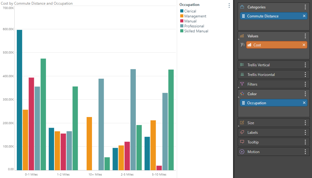
If the chip driving the color drop zone is hierarchical (or categorical), the behavior is less about conditional formatting, and rather about splitting the data up into multiple series. In the example below, occupation is used to color commute distance - but effectively it creates 5 series of data and is colored accordingly.
Value or Measure Chips
If the chip driving the color drop zone is a value metric, the behavior is mostly about conditionally formatting the values using mathematical logic. In some cases, users can elect to color the measures in each chart with discrete colors, to differentiate them - in which case, it treats the measures as a categorical series like a hierarchy.
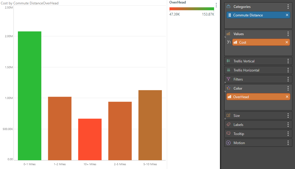
In the first example below, overhead is used to conditionally color commute distance, with the highest values appearing in green and the lowest appearing in red.
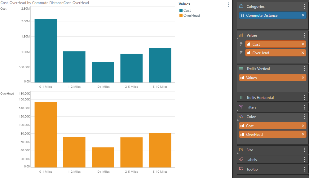
The second chart below treats measures like a categorical series, with 2 separate charts, each colored by a separate measure.
Using the Indicator Drop Zone
The Indicator drop zone is used in grids to drive mini KPI graphic adjustments in the cells of a grid visual - assigning and adjusting different icons, shapes or mini values based on user selection and logic. When used in gauge visualizations, the indicator drop zone is called the "Status drop zone" - and reflects almost identical functionality, driving the gauge's primary status value and its graphics. Both drop zones only accept orange value or measure chips - as such they are used exclusively for conditionally formatting.
Grids with mini KPIs
Grid based indicators or "mini KPIs" can be added to grid visualizations using the indicator drop zone and its sub drop-zones. Using this technique, each measure can have its own indicator driven by the same metric or a completely separate metric. To make selections that are not exclusive to measures only, users can manually build formulas or use the context menu generated conditional formatting to drive cell-centric logic.
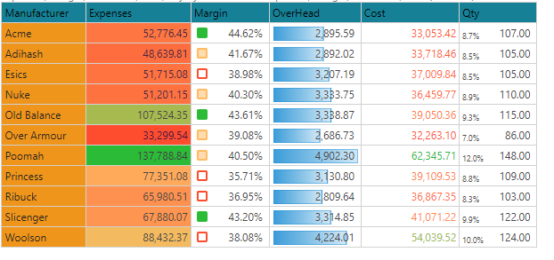
If the indicator graphics don't clash, multiple indicators can be used on the same measures and data cells. Percentage indicators can be used to display a measure as an indicator using a text value. In the grid below we see examples of colored shapes, data bars, foreground (font) scale and text (% of total).
Gauges
Gauge indicators are a separate visualization from grids, that extends the concept of data cell into a large tile with multiple data points and measures driving its appearance using the status drop zone and its sub drop-zones. Each gauge tile can contain values driving the "status" (typically the primary value), "actual" and "target" values (secondary), as well as bands. (The banding itself is comprised on multiple measures to set the start and end trim points). Given the complexity of manually build a gauge (which is possible using both drop zones directly or the advanced dialog box), most users will instead build KPI metrics using the KPI wizard in Formulate or quick KPIs directly in Discover. Both frameworks help to guide the user into creating all the key values necessary to draw a gauge.
Using 2 different KPI measures built with the KPI wizards, the image below shows "cylinder" and "arc" gauges. Each one has actual, target, status and multiple band values.
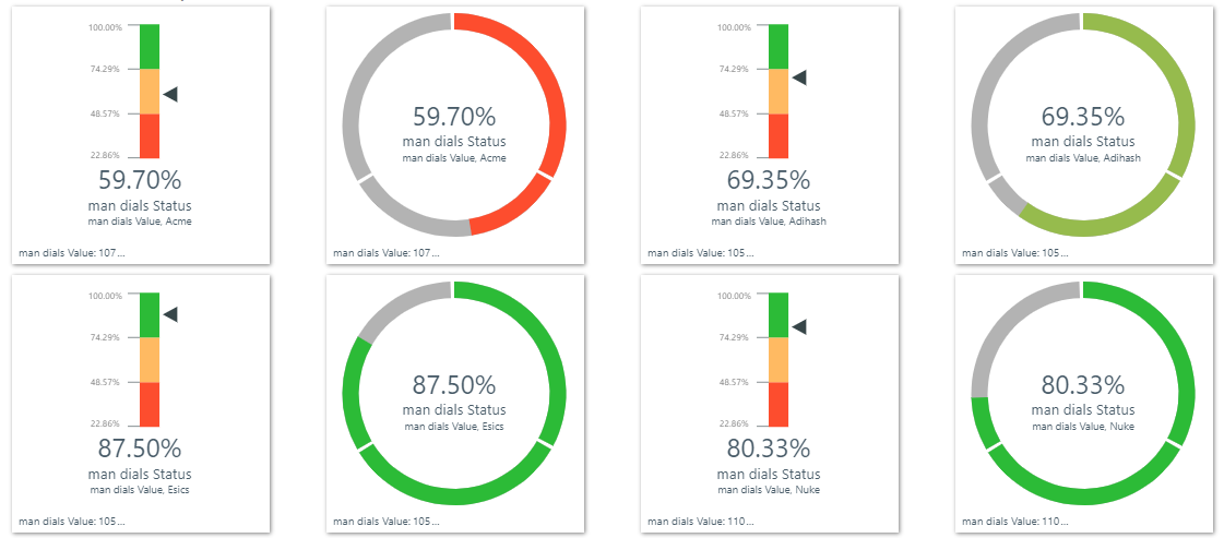
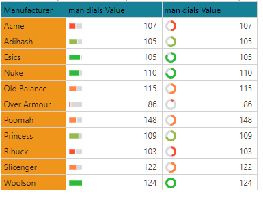
Since the KPI measures used above use the same framework as any other conditional formatting construct, they can just as easily be converted into grid based indicators or "mini KPIs". In the image below, the same gauges from above are shown in a matrix grid. Graphically, they indicate the same outcomes. However, the grid lacks some of the extra depth of the gauge.
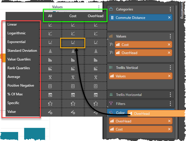
Using Sub-Drop Zones and Logic Options
For both the color and indicator drop zones there are "sub-drop zone" fly-out menus that provide an easy drag-and-drop method of using more advanced logic and options to configure the conditional formatting for the measure or value chips in their respective drop zones.
Depending on the scenario and drop zone type, user can pick the type of logic to use to drive the format (red box below), and also which visible measure in the visualization the logic should apply to (green box). Simply dragging and dropping the source chip to the required box (yellow box below), the user can select the combination they need in their visualization. Through this mechanism, the sub-drop zones offer a quick solution to many of the most obvious conditional formatting requirements.
Key here, is that the sub drop-zone offers quick access to built-in logic scenarios. This is not always the best conditional logic. For example, when designing KPI's with the wizard, this logic is often ignored and replaced with custom formulas for measuring "status" and the banding to decide whats good and whats bad.
- Click here to see more details on this process and examples
Quick Logical Options
The sub-dropzone quick selection options vary based on whether it is color or indicator; the type of indicator; and the type of visual. The table below summaries the options. Keep in mind, that these can all be changed or customized using the full conditional formatting dialog interface- for both colors and indicators.
- Click here for a greater explanation on the logic options for Conditional Formatting.
|
Logic |
Description |
|
Application |
|
Linear |
Spread from high to low using a simple linear and direct interpolation of the values |
|
All visuals except Text and shape indicators / gauges |
|
Logarithmic |
Spread from high to low using the log interpolation of the values |
|
All visuals except Text and shape indicators / gauges |
|
Exponential |
spread from high to low using the exponent interpolation of the values
|
|
All visuals except Text and shape indicators / gauges |
|
Standard Deviation |
Two color demarcation, showing those values over 2 standard deviations from the mean |
|
All visuals except Text and shape indicators / gauges |
|
Value Tertiles |
Three color demarcation, showing items based on spread of their values in the list for each tertile (successive 33rd percentile) |
|
Only Shape indicators / gauges |
|
Rank Tertiles |
Three color demarcation, showing items based on their value driven rank in the list by tertile (successive 33rd percentile) |
|
Only Shape indicators / gauges |
|
Value Quartiles |
Four color demarcation, showing items based on spread of their values in the list for each quartile (successive 25th percentile) |
|
For colors, but not for indicators |
|
Rank Quartiles |
Four color demarcation, showing items based on their value driven rank in the list by quartile (successive 25th percentile) |
|
For colors, but not for indicators |
|
Value Quintiles |
Five color demarcation, showing items based on spread of their values in the list for each quintile (successive 20th percentile) |
|
Most indicators, but not for colors |
|
Rank Quintiles |
Five color demarcation, showing items based on their value driven rank in the list by quintile (successive 20th percentile) |
|
Most indicators, but not for colors |
|
Average |
Two color demarcation, showing those values above or below the mean |
|
All visuals except Text indicators / gauges |
|
Positive Negative |
Two color demarcation, showing those values above or below zero |
|
All visuals except Text indicators / gauges |
|
Percentage of Total |
Values as a percentage of the total of the list |
|
Only text indicators / gauges |
|
% of Maximum |
Values as a percentage of the largest value in the list |
|
Only text indicators / gauges |
|
Specific |
A hard coded color without mathematical logic |
|
For colors, but not for indicators |
|
Value |
Colors driven by using the value of the items as RGB colors. See below for more. |
|
For colors, but not for indicators |
Value Color Sub Drop Zone
The Value Driven Colors feature driven through the Color sub drop zones and allows users to define their own logic for setting colors DIRECTLY to conditional format visualizations. The flexibility of the formulations coupled with the direct interpretation of the color values, means the permutations for formatting are endless.
- Click here for more on Value Driven Colors